
Improving Onboarding for Wegmans Meals2GO
Improving the Meals2GO experience through user research, design system integration, and collaborative UX/UI strategy.
Measls2GO Onboarding Redesign
As the UX/UI design intern on Wegmans' Digital Experience Team, I contributed to the redesign and optimization of the Meals2GO web and mobile platforms—driven by user behavior insights, A/B testing, and design system integration.

Devices
mobile
Skills
Role
UX/UI Designer
Timeline
June 2024-September 2025
Figma Design Systems + Variables, Branding, Product Design, Prototyping
Tools
Figma, Sketch, Zeplin
Project Goals
Redesigning the mobile onboarding experience for the Meals2GO app to boost engagement and simplify user entry.
Improve the first-time user experience by redesigning the onboarding flow and language
Communicate the value of the Meals2GO app within the first 60 seconds
Reduce user friction during key steps like account creation and location setup
Establish visual and tonal consistency
Increase retention and order completion for new mobile users
Design a scalable onboarding solution that fits within technical constraints
My Contributions
Audited existing onboarding flows and compared competitors
Led all user research efforts, including competitive audits and in-depth competitor analysis
Identified key pain points in the existing onboarding experience through heuristic evaluation
Sketched revised onboarding flows based on research insights
Created mid- to high-fidelity prototypes in Figma
Applied Wegmans’ design system for brand consistency
Collaborated with developers and UX leads to refine and implement design solutions
Presented findings and design proposals to cross-functional teams
Problem & Opportunity
The Challenge
The Meals2GO app was seeing drop-off during the onboarding process, with users often abandoning the app before placing an order or understanding its core value.
While the app offered convenience and personalized ordering, its onboarding experience lacked clarity, flow, and brand voice, leading to friction during setup.
I often asked myself “How might we create an onboarding experience that feels simple, engaging, and sets users up for success?”
Problem 1
Users dropped off during onboarding
Many new users exited the app before placing their first order.
Steps like creating an account and location permission access lacked clarity and motivation to do/allow.
Opportunity
Streamline the onboarding flow to reduce cognitive load and highlight key benefits early on.
Problem 2
Value proposition was unclear
The app didn't immediately communicate what made Meals2GO unique or helpful.
Users weren’t guided through the features that made the experience efficient.
Opportunity
Introduce a concise, visually engaging welcome flow that builds user trust and showcases value upfront.


User Testing
To further understand the current(old) onboarding flow, I conducted remote usability testing using UserTesting.com. I created a task-based tests focused on:
-
I conducted remote usability tests on iOS and Android using UserTesting.com. Each participant completed onboarding tasks such as exploring the app, creating an account, choosing delivery preferences, and setting notifications. The goal was to uncover where users dropped off and what they found helpful or frustrating in the current Meals2GO onboarding flow.
-
Many users were surprised by the app’s purpose:
“I thought it would be a marketplace, but it turned out to be a supermarket app.”
“I had no idea what Wegmans offered before seeing the features.”
“The intro gave me a high-level overview, which was helpful.”Although most said the onboarding was informative, it didn’t leave a lasting impression:
“It’s mostly just text. I usually skip that kind of stuff.”
“I liked the progress dots, but the content didn’t hook me.” -
Users responded positively to a few UX elements:
Slide format with progress dots helped show completion
Concise benefit screens were informative
Clean visuals and photography caught attention
Content gave a sense of app functionality
“It kept me engaged because I could swipe through.”
“It was helpful, and I learned what the app could do.” -
Major pain points included:
Lack of interactivity → many users skipped screens
Boring visual hierarchy → small fonts, generic layouts
Poor field UX → birthday and password inputs frustrated users
Dismissible prompts → like notifications and sign-in
Low engagement → 95% bypassed key preference setup screens
“That birthday form was the worst I’ve seen.”
“I skipped most of it—just wasn’t interested in reading that much.”
“Why isn’t there a social sign-on option?” -
100% said onboarding was informative, but only a few found it engaging
95% of users skipped screens like “build shopping list” or delivery preferences
80% preferred social sign-on (Google, Apple, Facebook)
60% didn’t know where to sign up after onboarding
Only 25% selected “Allow” on the notification popup
-
Add bold headers and visual hierarchy to improve readability
Introduce subtle animations or GIFs to boost engagement
Replace generic copy with branded, friendly language
Personalize onboarding based on user state (guest, new, logged out)
Use branded modals to better introduce notifications or store selection
Integrate social sign-on options to reduce friction
These findings directly influenced new onboarding mockups that included visual storytelling, progression dots, improved layout structure, and differentiated flows for returning users.


Research & Discovery
As the lead researcher on this project, I began by auditing the existing onboarding experience. I conducted:


-
Identified usability issues such as vague copy, lack of visual hierarchy, and unclear user direction during initial setup.
-
Documented the onboarding process from app download to first order attempt, highlighting drop-off points.
-
Collaborated with the internal UX team to understand product goals and limitations.
-
The onboarding process had 5+ steps, including redundant location permissions and unclear CTAs. Users didn’t understand what the app did or how to use it and many never reached the ordering screen.
Competitive Analysis
Understand how other food delivery and grocery apps onboard users and set expectations during their first-time experience & identifying best practices and gaps.
-
Chick-fil-A – Fast food with a strong loyalty experience
Starbucks – Clean and brand-forward onboarding
Instacart – Location and delivery-focused grocery UX
DoorDash – Highly optimized ordering flow
Uber Eats – Clear user progression and personalization
-
Successful onboarding flows across Chick-fil-A, Starbucks, and Duolingo prioritized speed, simplicity, and visual clarity. Most apps introduce value early, let users browse before signing up, and guide them through setup with progress indicators or helpful CTAs. Strong onboarding isn’t just functional, it’s a brand moment.
-
Across testing and competitor examples, social sign-on stood out as a user expectation. 80% of our testers preferred signing in with Google, Apple, or Facebook. Chick-fil-A and Panera offer seamless login options, which reduce friction and improve user trust, something the original Meals2GO flow lacked.
-
Duolingo and Hopper set the bar with interactive, visually rich onboarding. Users in our tests responded positively to large images, clean layouts, and simple headlines. Apps like Starbucks use photography and friendly tone to reflect their brand early in the user journey, something we emulated in the redesign.
-
Apps like Target and Chipotle handle guest users by subtly prompting them to log in while still offering core app functionality. These cues help return users understand what they’re missing, whether it's saved lists or reward points. This inspired our recommendation for a clear “signed out” state in Meals2GO.
Click here to view Full Onboarding Research & Documentation
WIP Screens (made by UX Team)
-
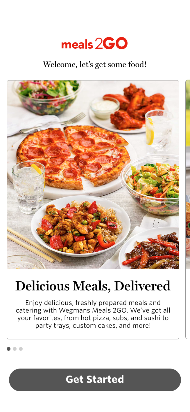
![]()
Welcome Screen
-
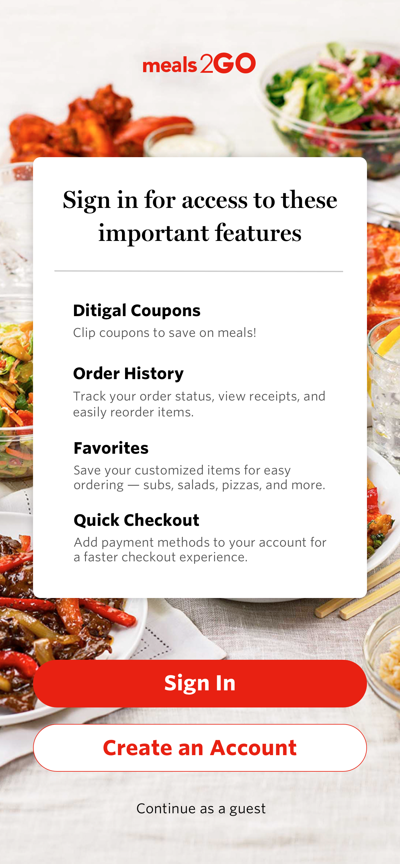
![]()
Showcase Benefits
-
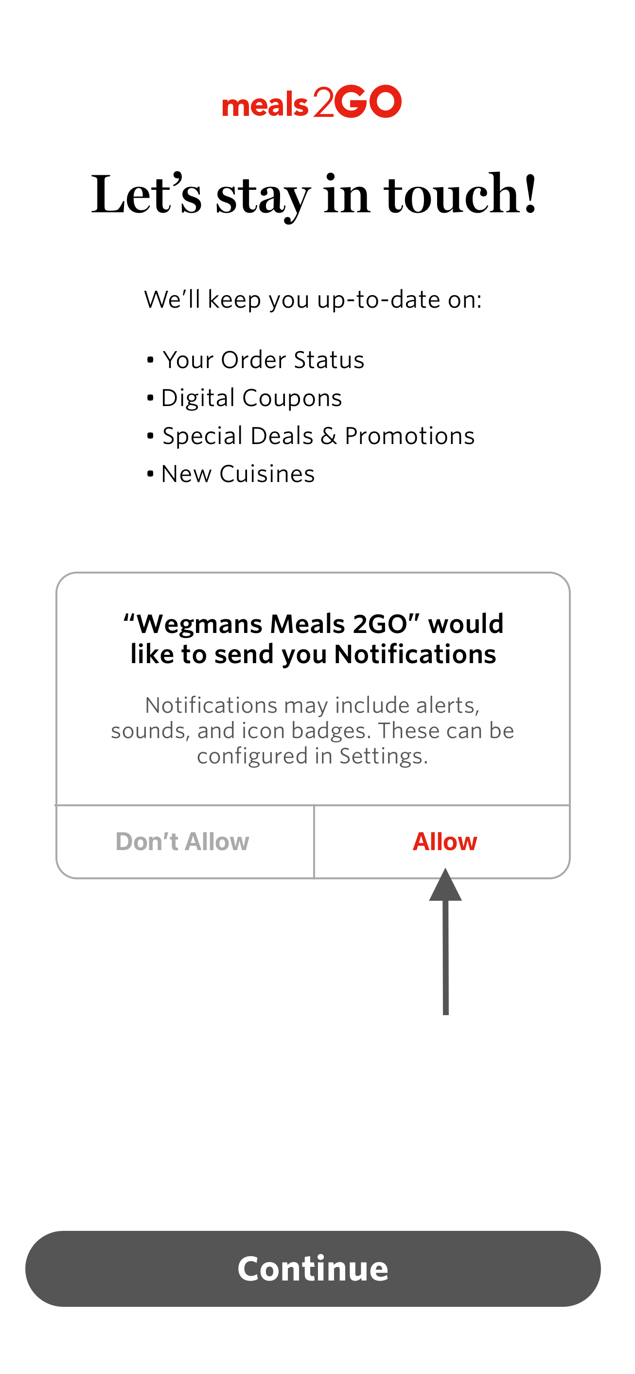
![]()
Notification Modal
-
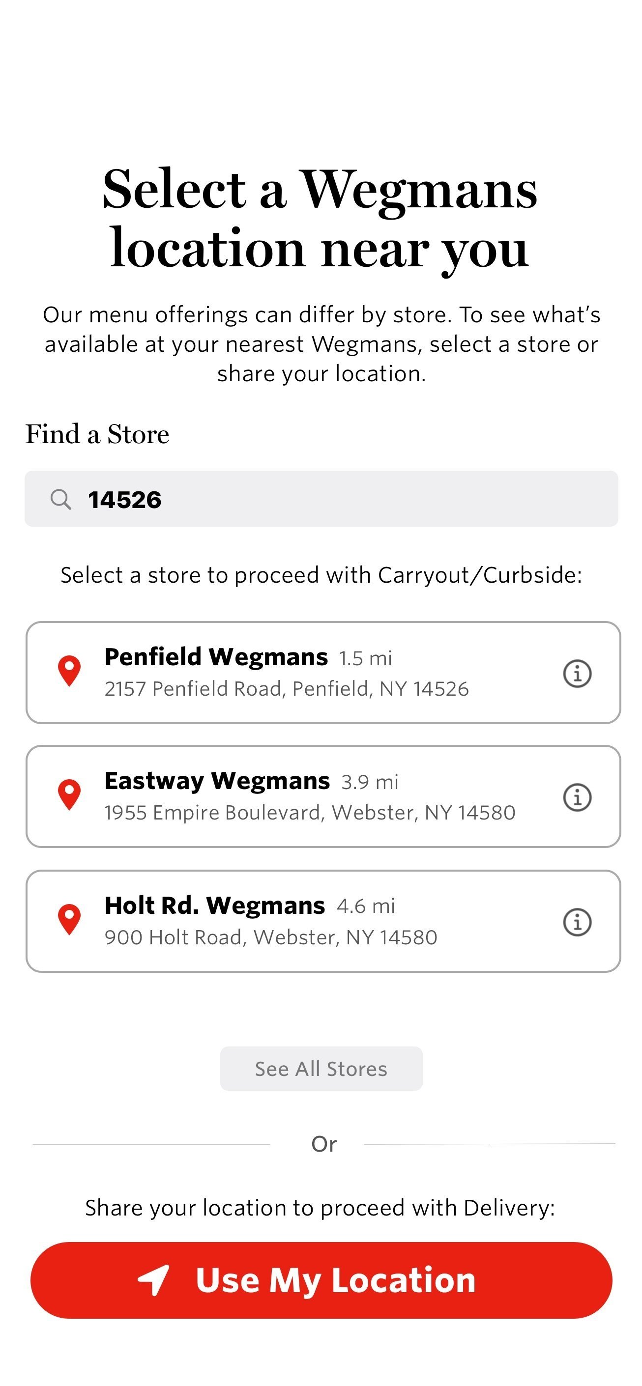
![]()
Location Services
Purpose.
The goal of this project was to reimagine the onboarding experience for the Meals2GO mobile app in a way that felt welcoming, intuitive, and purposeful. Through user research, competitive analysis, and iterative design, I uncovered critical usability gaps that were causing confusion, drop-off, and missed opportunities. By addressing these pain points directly, I created a simplified, visually engaging onboarding flow that guides users with clarity and intention.
At the heart of this project was a simple truth: pain points matter. Every skipped screen, every frustrating input, and every unclear prompt represented a user not getting what they needed. My job as a designer was to listen, observe, and solve… making the first-time experience feel not only usable but genuinely helpful.
This case study reinforced for me that impactful design is about more than aesthetics. It’s about building trust, reducing friction, and creating flow. I’m proud to have contributed to a product that serves real people, and to have brought purpose to every pixel by putting user needs first.